Showing posts with label mobile. Show all posts

Monday, November 26, 2012

Find: How mobile is taking over our computing load, hour by hour

How mobile is taking over our computing load, hour by hour

Although mobile has been coming on strong as a primary means of computing, it still lags overall desktop internet usage. But for some publishers who started on the web, there are already moments during the week when mobile drives the majority of traffic or sales.
Guardian

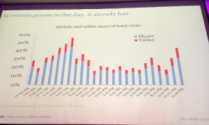
The Guardian’s traffic by hour

The Guardian’s Anthony Sullivan, group product manager for Guardian Core products at Guardian News & Media, said Monday that mobile — both smartphones and tablets — now contributes about 35 percent of traffic overall. That’s up from 10 percent at the start of 2011, when it was primarily smartphone traffic. (See disclosure below)

But at 6 a.m. to 7 a.m. in the morning local time, the Guardian gets more traffic from mobile devices. It also sees more mobile visitors than desktop visitors on Saturdays at 3 p.m. when the Premier League is under way.

Meanwhile, online design store Fab.com said late last month that on Saturdays between 12:00 a.m. and 6 a.m. local time, it sees 53 percent of its sales from mobile devices. On recent weekends, sales from mobile devices are now up to 40 percent, with weekend mornings before noon leading the way. Saturday evenings are also very popular with mobile users, with 44 percent of users buying on mobile devices between 6 p.m. and midnight.

The numbers are still early and these two properties are pretty popular with mobile users. Sullivan said in a Guardian story that the tipping point in favor of mobile might still be two years away. Fab’s CEO and co-founder Jason Goldberg, however, said based on the fast growth of mobile sales, he believes that Fab will see more parts of the day in which traffic from mobile devices goes over 50 percent in the coming months. And he said mobile will contribute more sales than desktop on certain days “soon.” Currently, 33 percent of Fab’s sales come from mobile devices.

The numbers underscore why mobile is so powerful. And it highlights the continuous nature of computing these days. The reality is today we are constantly on some type of computer throughout the day, moving back and forth between devices for different tasks and different settings. Mobile devices fill in the times when reaching for a laptop or desktop is more difficult, including early mornings, during lunch, as we settle in for the night and during the weekends....

Tuesday, October 2, 2012

Find: A behind-the-scenes look at LinkedIn’s mobile engineering

A behind-the-scenes look at LinkedIn’s mobile engineering


Aurich Lawson

LinkedIn is the career-oriented social network that prides itself on professional excellence. But the company's original mobile offering was anything but—it left much to be desired. There was an iPhone application, but no support for Android or tablets. The backend was a rickety Ruby on Rails contraption; afflicted with seemingly insurmountable scalability problems. And despite serving only seven or eight percent of the LinkedIn population, the company's original mobile build required approximately 30 servers in order to operate. This was clearly not made to sustain a growing mobile user base.

Now, a little over a year has passed since LinkedIn relaunched its mobile applications and website. And the company recently marked the anniversary by debuting a number of new mobile features, including real-time notifications and support for accessing company pages from mobile apps.

Mobile is gradually becoming a central part of the LinkedIn landscape. The company says roughly 23 percent of its users access the site through one of its mobile applications, up from ten percent last year. As our friends at Wired reported last month, the underlying design language and development philosophy behind the company’s mobile experience is playing an influential role as the company works to revamp its website.

Tuesday, August 7, 2012

Find: Mobile Websites vs Responsive Design: What’s the right solution for your business?

Mobile Websites vs Responsive Design: What’s the right solution for your business?

The following post originally appeared on the Google Mobile Ads Blog.

As more of your competitors Go Mo, building a mobile-friendly site becomes more of a priority for your business. Over the past two years alone, mobile search traffic has increased five-fold. Customers are searching for your business from their mobile phones, and you need to engage them with a mobile experience designed for completing on-the-go tasks from their small screens. Recently many businesses have been asking us about an emerging trend among web developers—responsive design—and if they should use it. While we believe that building a separate mobile website is an appropriate solution for certain businesses, it’s also important to understand how responsive design might fit into your plans to Go Mo.

What is responsive design? It is a website design technique that allows you to create a single website that will adapt to the device on which it’s being viewed, whether it’s a laptop, smartphone or tablet. A site built with responsive design will automatically resize for different devices, but it is up to you to prioritize the content that matters most to the mobile user. For example, a mobile user might need to quickly find your phone number or directions, whereas a tablet user might want a simpler way to make couch-surfing purchases. A site built using responsive design could prioritize click-to-call and click-to-map buttons, while the tablet site would focus on simplifying the shopping cart. For the technical details on how responsive design works for building mobile-friendly sites, read this blog post from the Google webmaster team.